
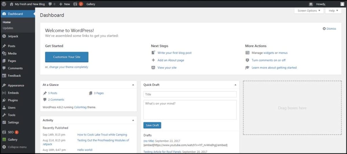
When it comes to setting up your wordpress site, one of the key things people often overlook is the size of the images you’re using.We’ve all been there—uploading that stunning photo, only to find it takes ages to load or messes up the layout. Finding the right image size isn’t just a techy detail; it’s crucial for keeping your site looking sharp and running smoothly.Whether you’re a blogger sharing your latest adventure or a small business showcasing your products, understanding image sizes can make a world of difference. So, let’s dive into some straightforward tips and tricks for getting your images just right, so your site shines without the hassle.
<img class="timage_class" src="https://novatixel.com/wp-content/uploads/2025/02/-Sizes.jpg" alt="Finding the Right Image Size for Your WordPress Site”>
Table of Contents
- Understanding Image Dimensions for Different Content Types
- Balancing Quality and Load Speed for Your Website
- Using Tools to Optimize Your Images Effortlessly
- Best Practices for Responsive Images on WordPress
- Common Image Formats and When to Use Each
- Q&A
- The Way Forward
Understanding Image dimensions for Different Content Types
When it comes to the web, not all images are created equal. Different types of content require specific image dimensions to look their best and fit seamlessly into the overall design. Whether you’re setting up blog posts, product pages, or social media graphics, knowing the right image size can make a big difference in how your site looks. If your images are to big, they may slow down your site, and if they’re too small, they might appear pixelated or blurry. Let’s dive into it!
For blog posts, you’ll want images that are clear and engaging. Typically, a common size is around 1200 x 675 pixels. This size works great for sharing on social media as well. Here are a few points to keep in mind:
- Maintain a 16:9 aspect ratio for best results.
- Use high-quality images to catch your reader’s eye.
- Consider how your images will appear in previews.
When it comes to product images, they’re crucial for e-commerce websites.shoppers want to see what they’re buying, so you need to present those products in stunning detail. The ideal dimensions for a product image are usually around 800 x 800 pixels. Here’s why that size works:
- It provides enough detail for customers to zoom in.
- It keeps load times manageable while still looking sharp.
- Many themes automatically resize images to fit grid layouts.
Lastly, for header images or banners, you frequently enough need them to span the entire width of your page. A standard size for these is around 1920 x 600 pixels. This size ensures that your header will look great on a variety of screen sizes. Here’s a quick reference table to compare these image sizes:
| Content Type | Recommended Image Size |
|---|---|
| Blog Post | 1200 x 675 px |
| Product image | 800 x 800 px |
| Header/Banner | 1920 x 600 px |

Balancing Quality and Load Speed for Your Website
When it comes to your WordPress site, the balance between quality and load speed is crucial. You might be using high-resolution images to make your content look great, but if they take forever to load, you’ll lose visitors faster than you can say “bounce rate.” Finding that sweet spot where images are both eye-catching and quick to load is key.
One of the first steps is understanding the right image size. Most of the time, you don’t need those massive files. A good rule of thumb is to keep your images under 100KB whenever possible.A bit of resizing can go a long way. Here’s a quick list to help you gauge what size works for different parts of your site:
- Hero Images: 1200-2000 pixels wide
- Content Images: 800-1200 pixels wide
- Thumbnails: 150-300 pixels wide
Additionally, using the right file format plays a huge role.JPEGs are frequently enough your best bet for photos, while PNGs are great for graphics with fewer colors. If you want to get fancy, consider using WebP for a good balance between quality and size. Here’s a simple table to give you a heads up on when to use wich format:
| Image Type | Best Format |
|---|---|
| Photographs | JPEG |
| Logos & Icons | PNG |
| Cuts & Animations | GIF |
| Web Pages | WebP |
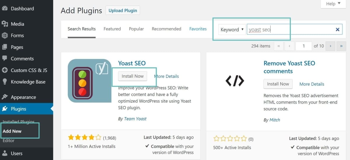
don’t forget about caching and plugins! using a caching plugin like WP Super Cache or W3 Total Cache can definitely help your images load faster by storing a static version of your page. Plus, plugins like Smush or ShortPixel can automatically compress your images without sacrificing quality. keeping a solid eye on both image quality and load times means happier users and better SEO for your site!

Using Tools to Optimize Your Images Effortlessly
One of the easiest ways to boost your site’s performance is by using the right tools to optimize your images. There are tons of plugins out there that take the hassle out of image editing. For example, you might want to check out options like Smush or EWWW Image Optimizer. These tools help you compress your images without losing quality, making your site faster and more user-friendly.
When you’re selecting images, keep in mind that size matters. Large images can slow down your site, which is a big no-no in the world of web design. With the right optimization tools, you can automatically resize and compress images as you upload them to your media library. This way, you won’t even have to think about it—just upload and go!
It’s also a good idea to prepare your images before uploading. You can use simple programs like Canva or even free online editors to ensure your images are the right dimensions. Plus, many of these tools let you batch process images so you can handle multiple files at once—talk about a time-saver!
| Tool Name | Key Feature |
|---|---|
| Smush | Automatic compression |
| EWWW Image Optimizer | Real-time optimization |
| Canva | User-friendly design |

Best Practices for responsive Images on WordPress
When it comes to responsive images, the goal is to ensure that your images look great on every device without slowing down your site. First off, always use the right size image for it’s designated spot. Not every image needs to be super high-res,so try to match the image dimensions to the display size. This helps in reducing the loading time and improves the overall user experience.
Another essential practise is to take advantage of WebP format wherever you can. WebP images are smaller in size while still maintaining good quality.You can use plugins like Smush or ShortPixel to easily convert your existing images to this format. Plus, don’t forget to enable lazy loading. This means that images below the fold will only load when users scroll down, which also speeds up the initial page load time.
Also, utilize srcset and sizes attributes in your image tags. These bits of code let the browser choose the best image size for the user’s screen. Here’s a simple example:
| HTML Tag | Description |
|---|---|
 | Ideal for responsive layouts |
Lastly, always remember to provide alternative text (alt text) for accessibility and SEO. Not only does it help search engines understand what the image is about, but it’s also essential for visually impaired users who rely on screen readers. So, always take a moment to craft a brief, descriptive text for each image. This way, you get the best of both worlds: happy users and better search engine rankings!

Common Image Formats and When to Use Each
When it comes to choosing the right image format for your WordPress site, it really comes down to what you’re using the images for. JPEG is a popular choice since it offers a good balance of quality and file size. It’s great for photos or images with lots of colors and gradients. Just keep in mind, if you save it too much, you might lose some quality – so be careful with those edits!
If you need something a bit sharper, especially for logos or icons, you might want to go with PNG. This format supports transparency and can handle text and graphics really well. It’s not as small as JPEGs, but the crispness can be worth it. Plus,you won’t lose quality no matter how many times you save it. So, if having clean edges is important, PNG is the way to go.
For animations or moving images, you can’t beat GIF. It’s perfect for simple animations and low-color graphics, but keep in mind that it has a limited color palette which can effect the quality for more colorful images.So, if you’re looking to share some fun animations or quirky graphics, GIF is your go-to format, but just know its limits.
Lastly, there’s SVG, which is awesome for vector graphics. If you’ve got logos or illustrations that need to be scaled up or down without losing quality,SVG is the champ here. Just be sure your audience is using browsers that support it, as older ones might struggle. These formats can frequently enough be mixed on the same site to cater to various needs, but knowing when to use each can definitely help your site look sharp and load quickly!

Q&A
Q&A: Finding the Right Image Size for Your WordPress Site
Q: Why does the size of an image matter for my WordPress site?
A: Great question! The size of your images plays a big role in how your website looks and performs. If your images are too large, they can slow down your site, which drives visitors away. But if they’re too small, they can look pixelated or blurry, which isn’t a good look! The key is to strike a balance—make sure they’re the right size for fast loading and clear visuals.
Q: What’s the ideal image size for a WordPress site?
A: It really depends on where you’ll be using the image! For full-width banners, you might want images that are at least 1200 pixels wide. For regular blog post images, something around 750 to 800 pixels wide will usually work just fine. Just keep in mind folks are viewing on all kinds of devices, so having responsive images can help!
Q: How do I know if my images are too big?
A: If your images are over 1MB in size, they’re probably too big.You can use online tools to check the file size before uploading. Also, if you notice that your page load time is dragging, giant images might be to blame. There are plugins you can use that analyze your media library and highlight any oversized images.Q: Can I change the size of my images after I’ve uploaded them?
A: Totally! wordpress allows you to resize images directly in the media library. Just click on the image, and there’s an option to edit—plus, you can crop, rotate, and do other tweaks if you want. Just remember,resizing can affect quality,so keep an eye on things.
Q: What file formats should I use for my images?
A: JPEG is usually a solid choice for photos as it offers good quality with a smaller file size. For graphics or images with fewer colors, PNG is better because it keeps everything sharp and clear. If you need transparency, PNG is your friend. And of course, GIFs are perfect for those fun little animations!
Q: Are there any tools you recommend for optimizing images?
A: Absolutely! Tools like TinyPNG or JPEGmini are great for compressing your images without losing quality. If you prefer plugins, WP Smush and ShortPixel are awesome for automatically optimizing images when you upload them to your site.
Q: How often should I check the image sizes on my site?
A: It’s smart to review your images every now and then, especially if you’ve added a lot of new content. Regular checks help ensure everything runs smoothly and that your site stays user-friendly. Plus, optimizing old images can give your site a performance boost!
Q: Any final tips for choosing the right image sizes?
A: Just remember: don’t sacrifice quality for speed, and vice versa! Always preview your images before you hit publish. and if you’re ever in doubt, err on the side of going slightly larger and optimizing afterward. Following these tips will definitely help your site look great and keep it running smoothly!
The Way Forward
In wrapping up, figuring out the right image size for your WordPress site doesn’t have to be a headache. It’s all about balancing quality with speed and making sure your visitors get the best experience possible. Whether you’re showcasing mouthwatering food pics, stunning landscapes, or just some cute cat photos, having the right dimensions will help your content shine without slowing things down.
So, take the time to experiment with different sizes and see what works best for your specific needs. Don’t forget to optimize those images too—compress them down a bit, so your site zips along without dragging its feet. Remember, it’s all about making your website look good and perform well. Happy blogging, and here’s to your site looking its best!